Not Found
Cannot read properties of null (reading 'code')
Not Found
Not Found
Not Found
Not Found
Not Found
Not Found
Not Found
Not Found
Not Found
Not Found
Not Found
Not Found
Not Found
Not Found
Not Found
Not Found

Submitted

Blog Preview Card - HTML/CSS

IsASecret 40

@IsASecret

Desktop design screenshot for the Blog preview card coding challenge

This is a solution for...

  • HTML
  • CSS
1newbie
View challenge

Design comparison


SolutionDesign

Solution retrospective


What are you most proud of, and what would you do differently next time?

I feel like my use of Flexbox and media queries improved, and figured out how media queries cascade/override one another based on the screen size satisfying certain conditions. Overall happy with the result here, I could have spent more time tweaking the font spacing/size, element padding and margins, etc to get it more true to the original design but I mostly wanted to work to the spirit of the challenge rather than spend a bunch of time getting it 'perfect'.

What challenges did you encounter, and how did you overcome them?

Not a challenge per se, but I was thinking I maybe could have used the vh and vw values to adjust the size of elements so it would be more dynamically responsive to screen size changes, rather than just hardcoding 3 different sizes. I was thinking maybe clamp() would be the way to go about this, so I could keep the values within a reasonable range, but also not have to hardcode values for multiple media queries.

What specific areas of your project would you like help with?

See above, I'm open to suggestions on how to achieve a more dynamic solution for styling responsiveness.

Community feedback

@Oczywsziysya

Posted

Well done :)

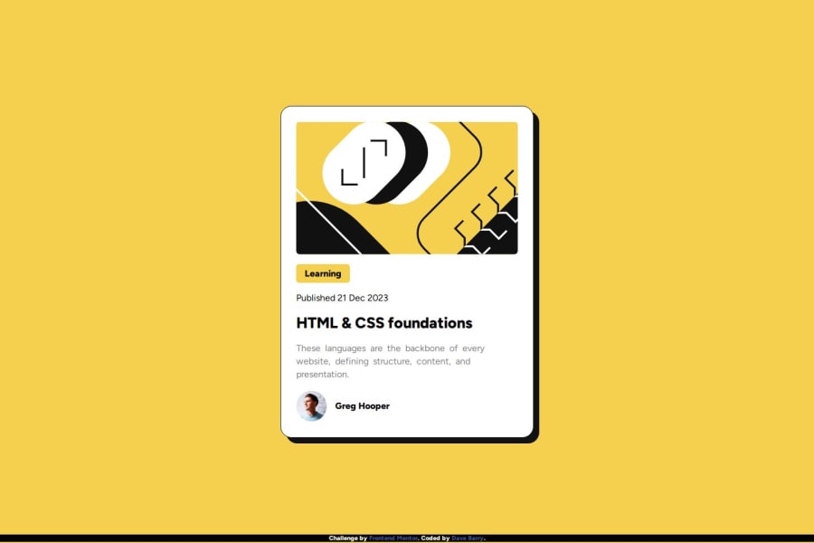
Just one thing, maybe you didn't notice while inspecting the desired outcome, but you should have added a :hover effect to the main card as well, so that the box-shadow will grow bigger when the cursor is over the card.

I'm a beginner, so take my words with a grain of salt, but maybe it'd be better to use max-width instead of a fixed width to the card? I think this would improve the overall responsiveness and in this case it'll look good even without using media-queries. Maybe this resource will be helpful to you:

  • A practical guide to responsive web design by Kevin Powell - Really useful video about responsive designs, the author highlights that media-queries are often misused/overused and that most of the time we can just give some hints to the browser and it will take care of the responsiveness.

Marked as helpful

1

IsASecret 40

@IsASecret

Posted

@Oczywsziysya

Thanks for the feedback! I totally missed the box shadow part, ill have to fix that. And I like the idea of using maxwidth to keep things more responsive. Thanks!

0

Please log in to post a comment

Log in with GitHub
Discord logo

Join our Discord community

Join thousands of Frontend Mentor community members taking the challenges, sharing resources, helping each other, and chatting about all things front-end!

Join our Discord